
[#15] The chart your financial plan never shows you
There is a picture most of us carry in our heads when we think about retirement finances. A line. It starts somewhere around where we are now — a portfolio balance, a savings number, whatever the adviser’s model spat out last time — and it travels to the right, gently downward depending on the assumed return and the assumed drawdown, arriving at some future age with a number still attached. The line is smooth. The future is legible. The plan is working.
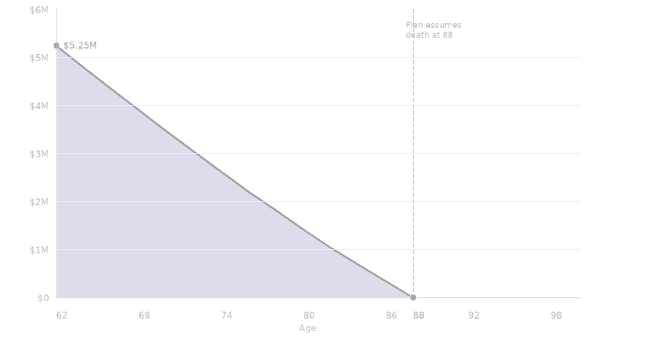
The picture most financial plans show you. One outcome ending at life expectancy. No surprises.
This picture is not a lie, exactly. It is what financial projections produce when they are run on single assumptions: a fixed rate of return, a fixed inflation rate, a fixed spending level, and a fixed lifespan. It is a useful simplification. It is also, as a representation of what will actually happen, almost entirely fictional.
We all know this, somewhere. We have watched what happened to parents or peers — the unexpected illness, the market that did not recover in time, the inheritance that arrived too late to matter. We know life does not move in straight lines. But our financial plans have been built as if it does, and we have found it easier not to press on that.
Here is what a single financial life actually looks like.
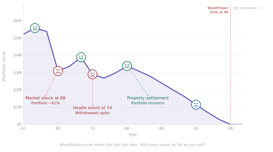
One lived experience. WealthSpan ends at 98. Life continues regardless.
That line is not a forecast. It is an example of lived experience — the market shock at 68 that cuts the portfolio by 41% in a single year, the slow crawl back, the health event at 74 that spikes withdrawals before the portfolio stabilises, the property settlement at 80 that provides an unexpected reprieve. And then the long, painful decline to a seemingly inevitable zero.
But the most important element in the whole image is the vertical line at 98.
That is when the WealthSpan ends. The age axis continues to the right. Life has not ended. It just continues without financial support.
Notice that this line runs to ninety-eight, not eighty-eight. That gap is deliberate.
The first illustration with the even line assumes death at 88 — a reasonable life expectancy figure, but one that is calculated at birth across the whole population. But by the time you reach 85, say, your conditional life expectancy has already shifted considerably further to the right, because you have survived everything that claims lives earlier.
Life expectancy is an average, by definition, which means half the population outlives whatever figure a planner plugs in (and half doesn’t). And that average is itself rising, as medicine and technology extend the range of what is possible. Planning to 88 is not conservative — it is, statistically, planning to run short.
Most financial plans are built as if that vertical line does not exist — or at least, as if it will fall conveniently beyond the edge of the page. What I want to show you next is the fuller picture: not one possible path, but the entire range of paths.
The range of futures: ‘confidence intervals’
The chart below shows the same starting point — $5.25M at age 62 — but instead of a single line, it shows three shaded bands representing the full distribution of mapped outcomes across a thousand simulated financial lives.
When you unpack them into their statistical likelihood, you get three ‘confidence intervals’ (more on that in a moment) …
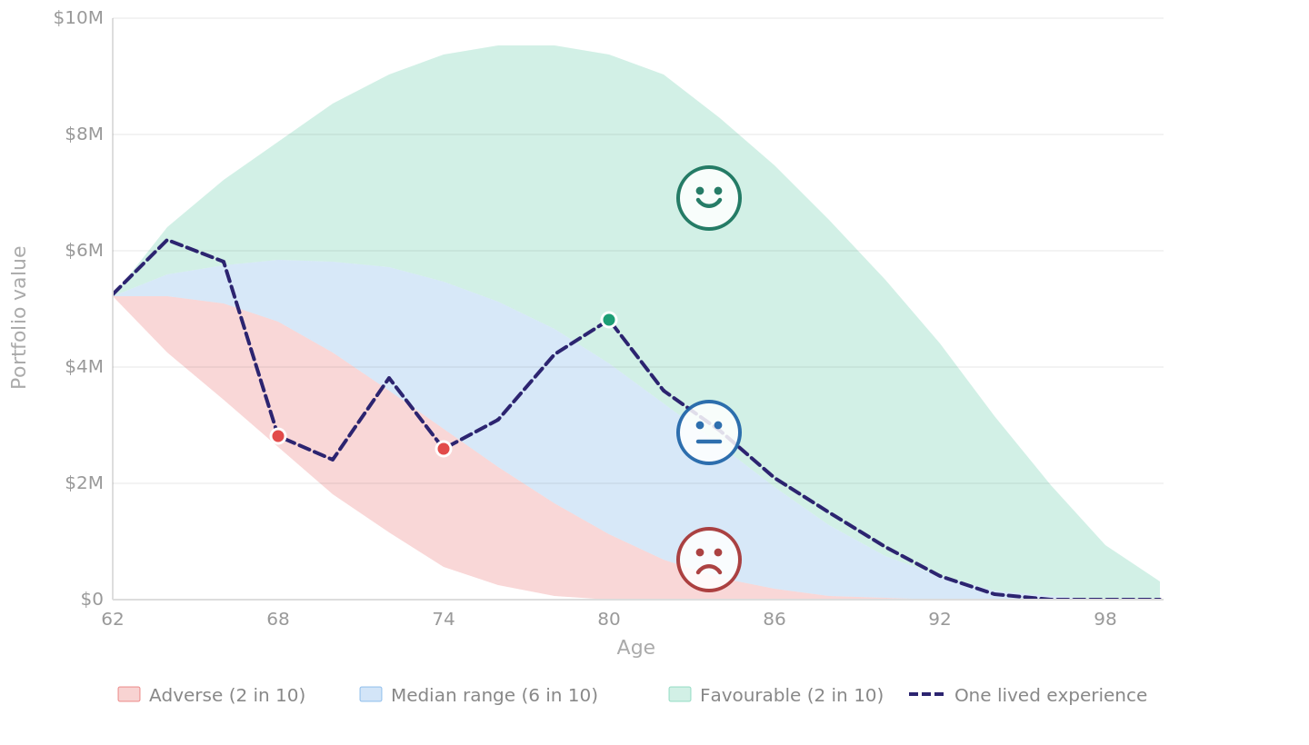
The full distribution of outcomes from $5.25M at age 62. WealthSpan ends when your band hits zero.
The blue band in the middle represents the range where – of the thousand possible futures – the ‘middle 60%’ landed. If markets perform within normal historical ranges, if your health spending tracks broadly with the averages, if your super drawdown is reasonably calibrated — you are probably somewhere in here. Not on a specific line within it, but somewhere across its width.
The red band at the bottom represents the adverse two in ten. Not catastrophic, necessarily, but unfavourable sequencing (like a major market fall in the early years of drawdown, an unexpected and sustained health cost, a family event that requires capital) – coupled with a fragile plan.
If you are in the red band, your WealthSpan — the length of time your wealth can sustainably support your desired life — ends earlier than you planned (or, to be more precise, your financial life ends earlier because of how you planned).
The green band at the top is the favourable two in ten. Markets cooperate, health costs stay modest, an inheritance arrives or a property settles well – capital accumulates or holds its ground longer than expected – coupled with smart decisions.
Why are smart decisions part of the formula? Because these wins can always be squandered — look at how long lotto winners hold onto their winnings. This is not just good luck at play here. Good planning capitalises on these events to deliver a healthier WealthSpan.
The critical insight here is this: being in the red band — a poor WealthSpan — has more to do with having a fragile plan than it does with bad luck. Avoiding the red band, an unhealthy WealthSpan, is a feature of good planning, not good fortune. The same is true when it comes to being in the green band – a run of luck is nice but without a smart way to capitalise on it, opportunities are squandered.
The question the chart asks
Most people, when they look at retirement projections, are asking the wrong question. They are asking: what will my portfolio return? Or am I saving enough? Or, at the more anxious end, will the market crash?
The right question — the one these charts are designed to surface — is simpler and more empowering: what do I have to do to ensure my WealthSpan reaches as far as I will?
This is what Full Spectrum Forecasting delivers.
Rather than building a plan around a single assumption — one line, one rate of return, an average life expectancy — it models the full spectrum of possible outcomes across a distribution, and ranks that distribution into confidence intervals.
It stress-tests the plan against the red band. It asks what good decisions take advantage of being in the green band.
It identifies the structural decisions that improve resilience: the drawdown sequencing that reduces sequence-of-returns risk, the liquidity reserve that prevents forced asset sales at the wrong moment, the spending flexibility that creates buffer when markets turn. It maps the threats, weaknesses and risks, and establishes contingency responses — plans B, C and D — should those risks emerge (which we are seeing play out on the world stage right now).
The goal is not to guarantee a specific outcome — no model can do that. The goal is a healthy WealthSpan: the result of building a stronger, more robust planning framework that supports a longer and much healthier lifespan going forward.
What this means in practice
The constructive reading of these charts is this: the adverse band is real, but so is the structure that reduces your exposure to it. So too is the favourable green band — it is not good luck, it is capitalising on events with smart decisions.
The key insight in this exercise is that we are focusing on what is within your control. A run of poor luck does not necessarily consign you to an unhealthy WealthSpan, any more than a run of good fortune automatically delivers a worry-free existence.
Using a robust framework is what is at play here. We are not trying to predict which path your line will take — that’s an impossible quest. But building a plan that is resilient across the range of paths, and honestly assessing where the risks actually live — that is what delivers a WealthSpan that supports a stronger, longer life.